Components
This is the compoents sectionAlart
This is still a wipClass
btn btn-secondary btn-secondary-
Enjoy Podcasts? Privacy YouTuber "TheHatedOne" and I got together to discuss this topic in-depth.
-
<div class="alert"> <i class="icon-mic text-lg"></i> <span>Enjoy Podcasts? Privacy YouTuber "TheHatedOne" and I got together to discuss this topic in-depth.</span> </div> -
.alert {
    @apply bg-gray-600;
    @apply text-white;
    @apply text-sm;
    @apply py-4;
    @apply px-9;
    @apply rounded-md;
    @apply flex;
    @apply break-words;
    @apply w-full;
    @apply space-x-4;
    @apply items-center;
    @apply justify-center;
}

.alert span {
    @apply text-white;
}
-
Enjoy Podcasts? Privacy YouTuber "TheHatedOne" and I got together to discuss this topic in-depth.
-
<div class="alert-primary"> <i class="icon-mic text-lg"></i> <span>Enjoy Podcasts? Privacy YouTuber "TheHatedOne" and I got together to discuss this topic in-depth.</span> </div> -
.alert-primary {
    @apply alert;
    @apply bg-safing-blue-600;
}

.alert-primary>.link {
    @apply text-white;
}
-
Alpha Software: Portmaster is in active development
-
<div class="alert-tiny"> <i class="icon-mic text-md"></i> <span>Alpha Software: Portmaster is in active development </span> </div> -
.alert-tiny {
    @apply alert;
    @apply text-xs;
    @apply rounded-full;
    @apply py-2;
    @apply px-4;
    @apply space-x-3;
    @apply justify-start;
}
Button
This is still a wipClass
btn btn-secondary btn-secondary-
-
<button class="btn">Take back your freedom</button> -
.btn {
    @apply px-10;
    padding-top   : 0.8rem;
    padding-bottom: 0.8rem;
    @apply bg-gray-500;
    @apply rounded-full;
    @apply uppercase;
    @apply font-semibold;
    @apply text-white;
    @apply text-center;
    @apply text-xs;
    @apply inline-flex;
    @apply items-center;
    @apply leading-normal;
    @apply whitespace-normal;
    @apply cursor-pointer;
    @apply hover-scale-in;
}

.btn[disabled],
.btn[disabled],
.btn[disabled],
.btn[disabled] {
    @apply bg-safing-gray-100;
    @apply text-safing-gray-400;
    @apply cursor-not-allowed;
}

.btn[disabled] i,
.btn[disabled] i,
.btn[disabled] i,
.btn[disabled] i {
    @apply text-safing-gray-400;
}

.btn[disabled]:hover,
.btn[disabled]:hover,
.btn[disabled]:hover,
.btn[disabled]:hover {
    @apply transform;
    @apply scale-100;
}

.btn i,
.btn i,
.btn i,
.btn i {
    @apply align-baseline;
}
-
-
<button class="btn-primary">Take back your freedom</button> -
.btn-primary {
    @apply btn;
    @apply bg-safing-blue-500;
}
-
-
<button class="btn-secondary">Take back your freedom</button> -
.btn-secondary {
    @apply btn;
    @apply bg-black;
}
Card
This is still a wipClass
btn btn-secondary btn-secondary-
The Assignment:
Revisit the RSS feeds for the blog, the podcast and maybe even the newsletter. We'll see. Make them work.
-
<div class="card"> <label class="card-label" for="card-toggle-anchor-2"> <div class="wrapper-left"> <div class="tag-list"> <span class="tag-spn"> SPN </span> </div> <div class="card-title"> <i class="icon-tick text-green-500"></i> <h1 class="title">Create RSS Feeds</h1> </div> </div> <div class="wrapper-right"> <div class="wrapper-right-profiles"> <div class="circular-profile" tooltip="David"> <img src="https://safing.io/assets/img/profiles/david.png"> </div> <div class="circular-profile" tooltip="David"> <img src="https://safing.io/assets/img/profiles/david.png"> </div> <div class="circular-profile" tooltip="David"> <img src="https://safing.io/assets/img/profiles/david.png"> </div> </div> <i class="icon-arrow"></i> </div> </label> <input class="card-input-toggle" id="card-toggle-anchor-2" type="checkbox"> <div class="card-dropdown-toggle"> <div class="card-dropdown-content"> <p>The Assignment:</p> <br> <p>Revisit the RSS feeds for the blog, the podcast and maybe even the newsletter. We'll see. Make them work.</p> </div> </div> </div> -
.card,
.card-extended {
    @apply h-max;
    @apply max-w-7xl;
    @apply block;
    @apply rounded-lg;
    @apply bg-white;
    @apply card-shadow;
}

.card-extended .card {
    border-bottom: solid 1px rgba(0, 0, 0, 0.15);
    border-top: solid 1px rgba(0, 0, 0, 0.15);
    @apply rounded-none;
    margin-bottom: 2.5rem;
}


.card-extended > .card-label,
.card > .card-label {
    @apply z-10;
    @apply flex;

    @apply pl-8;
    @apply pr-8;

    @apply pt-8;
    @apply pb-11;
    @apply cursor-pointer;
}

.card-extended .card .card-label {
    padding-bottom: 1rem;
    padding-left: 1rem;
    padding-right: 1.5rem;
    padding-top: 1rem;

}

.card-extended .wrapper-left,
.card .wrapper-left {
    @apply w-full;
}

.card-extended .tag-list,
.card .tag-list {
    @apply flex;
    @apply items-center;
    @apply m-0;
    @apply p-0;
}

.card-extended .card .card-title {
    @apply pt-0;
}

.card-extended .card-title,
.card .card-title {
    @apply flex;
    @apply items-center;

    @apply w-full;
    @apply pt-6;
}

.card-extended .card-title [class^='icon'],
.card-extended .card-title [class*=' icon'],
.card-extended .card-title [class^='icon-'],
.card-extended .card-title [class*=' icon-'],
.card .card-title [class^='icon'],
.card .card-title [class*=' icon'],
.card .card-title [class^='icon-'],
.card .card-title [class*=' icon-'] {
    @apply text-xl;
}

.card-extended .card-title .title,
.card .card-title .title {
    @apply text-black;
    @apply pl-3;
    @apply text-lg;
}

.card-extended .card .title {
    @apply pl-0;
    @apply text-md;
}

.card-extended .wrapper-right,
.card .wrapper-right {
    @apply flex;
    @apply justify-end;
    @apply w-max;
    @apply items-center;
    @apply space-x-4;
}

.card-extended .wrapper-right .wrapper-right-profiles,
.card .wrapper-right .wrapper-right-profiles {
    @apply flex;
    @apply space-x-1;
}

.card-extended .icon-arrow,
.card .icon-arrow {
    @apply text-sm;
    @apply font-normal;
    @apply text-black;

    @apply transform;
    @apply rotate-180;
}

.card-extended .card .card-dropdown-toggle {
    @apply pb-0;
    padding-left: 1rem;
    padding-right: 1rem;
}

.card-extended .card-dropdown-toggle,
.card .card-dropdown-toggle {
    @apply pb-14;
    @apply pl-8;
    @apply pr-8;
    @apply hidden;
    @apply cursor-auto;
}

.card-extended .card-dropdown-content > h1,
.card .card-dropdown-content > h1 {
    @apply text-black;
    font-size: 1.1rem;
    font-weight: 500;
    margin-top: 1.5rem;
}

.card-extended .card-dropdown-content > h1:first-child,
.card .card-dropdown-content > h1:first-child {
    margin-top: 0;
}

.card-extended .card-dropdown-content > p {
    margin-top: 1rem;
}

.card-extended .card p {
    margin-top: 0;
}

.card-extended .card-dropdown-content {
    @apply text-md;
    @apply pl-0;
    @apply pb-4;
}

.card-extended .card-dropdown-content .card .title{
    @apply pl-0;
}

.card .card-dropdown-content {
    @apply text-black ;
    @apply text-md;
    @apply pl-0;
}


.card-input-toggle {
    @apply hidden;
}

.card-input-toggle:checked+.card-dropdown-toggle {
    @apply block;
}

.card-shadow {
    @apply relative;
}

.card-shadow::after {
    box-shadow: 0 0 5px 0 rgba(0, 0, 0, 0), 0 0 90px 0 rgba(59, 93, 199, 0.1);
    content: '';
    @apply h-full;
    @apply left-0;
    @apply absolute;
    @apply top-0;
    @apply w-full;
    z-index: -1;
}
-
Revisit the RSS feeds for the blog, the podcast and maybe even the newsletter. We'll see. Make them work.
Safing Blog RSS Finally Arrived
This has been a request for over a year. And to be honest, the reason we never added this was kinda silly: Since progress update posts (like the one you are reading now) heavily rely on CSS tricks in order to support noJS, a RSS reader cannot properly format the progress update. Instead it displays a rather broken blog post. With no easy solution in sight, the RSS feed just got postponed indefinitely. But after finally revisiting this topic we came up with a simple solution. Just add a disclaimer to progress update posts that they are only viewable in the web-view. Problem solved. Proper communication, and finally a RSS feed everyone can subscribe to.
-
<div class="card-extended">
    <label class="card-label" for="card-toggle-anchor-10">
        <div class="wrapper-left">
            <div class="tag-list">
                <span class="tag-spn">
                    SPN
                </span>
            </div>
            <div class="card-title">
                <i class="icon-tick text-green-500"></i>
                <h1 class="title">Create RSS Feeds</h1>
            </div>
        </div>
        <div class="wrapper-right">
            <div class="wrapper-right-profiles">
                <div class="circular-profile" tooltip="David">
                    <img src="https://safing.io/assets/img/profiles/david.png">
                </div>
                <div class="circular-profile" tooltip="David">
                    <img src="https://safing.io/assets/img/profiles/david.png">
                </div>
                <div class="circular-profile" tooltip="David">
                    <img src="https://safing.io/assets/img/profiles/david.png">
                </div>
            </div>
            <i class="icon-arrow"></i>
        </div>
    </label>
    <input class="card-input-toggle" id="card-toggle-anchor-10" type="checkbox">
    <div class="card-dropdown-toggle">
        <div class="card-dropdown-content">
            <div class="card">
                <label class="card-label" for="card-toggle-anchor-10-1">
                    <div class="wrapper-left">
                        <div class="card-title">
                            <h1 class="title">Assignment</h1>
                        </div>
                    </div>
                    <div class="wrapper-right">
                        <i class="icon-arrow"></i>
                    </div>
                </label>
                <input class="card-input-toggle" id="card-toggle-anchor-10-1" type="checkbox">
                <div class="card-dropdown-toggle">
                    <div class="card-dropdown-content">
                        <p>Revisit the RSS feeds for the blog, the podcast and maybe even the newsletter. We'll see. Make them work. </p>
                    </div>
                </div>
            </div>
            <h1>Safing Blog RSS Finally Arrived</h1>
            <p>
                This has been a request for over a year. And to be honest, the reason
                we never added this was kinda silly: Since progress update posts
                (like the one you are reading now) heavily rely on CSS tricks in
                order to support noJS, a RSS reader cannot properly format the
                progress update. Instead it displays a rather broken blog post. With
                no easy solution in sight, the RSS feed just got postponed indefinitely.
                But after finally revisiting this topic we came up with a simple solution.
                Just add a disclaimer to progress update posts that they are only viewable
                in the web-view. Problem solved. Proper communication, and finally a RSS
                feed everyone can subscribe to.
            </p>
        </div>
    </div>
</div>
Font-Icon
This is still a wipClass
btn btn-secondary btn-secondary-
General IconsSocial IconsPlatform Icons
-
<div class="space-y-10">
    <div class="space-y-7">
        <span>General Icons</span>
        <div class="grid grid-cols-12 auto-cols-max grid-flow-row gap-y-10">
            <div class="bg-white p-4 w-max m-auto" tooltip=".icon-earth">
                <i class="icon-earth text-lg"></i>
            </div>
            <div class="bg-white p-4 w-max m-auto" tooltip=".icon-reload">
                <i class="icon-reload text-lg"></i>
            </div>
            <div class="bg-white p-4 w-max m-auto" tooltip=".icon-files">
                <i class="icon-files text-lg"></i>
            </div>
            <div class="bg-white p-4 w-max m-auto" tooltip=".icon-cog">
                <i class="icon-cog text-lg"></i>
            </div>
            <div class="bg-white p-4 w-max m-auto" tooltip=".icon-arrow">
                <i class="icon-arrow text-lg"></i>
            </div>
            <div class="bg-white p-4 w-max m-auto" tooltip=".icon-cog-ring">
                <i class="icon-cog-ring text-lg"></i>
            </div>
            <div class="bg-white p-4 w-max m-auto" tooltip=".icon-cross">
                <i class="icon-cross text-lg"></i>
            </div>
            <div class="bg-white p-4 w-max m-auto" tooltip=".icon-external">
                <i class="icon-external text-lg"></i>
            </div>
            <div class="bg-white p-4 w-max m-auto" tooltip=".icon-heart">
                <i class="icon-heart text-lg"></i>
            </div>
            <div class="bg-white p-4 w-max m-auto" tooltip=".icon-info">
                <i class="icon-info text-lg"></i>
            </div>
            <div class="bg-white p-4 w-max m-auto" tooltip=".icon-mic">
                <i class="icon-mic text-lg"></i>
            </div>
            <div class="bg-white p-4 w-max m-auto" tooltip=".icon-play">
                <i class="icon-play text-lg"></i>
            </div>
            <div class="bg-white p-4 w-max m-auto" tooltip=".icon-podcast">
                <i class="icon-podcast text-lg"></i>
            </div>
            <div class="bg-white p-4 w-max m-auto" tooltip=".icon-rss">
                <i class="icon-rss text-lg"></i>
            </div>
            <div class="bg-white p-4 w-max m-auto" tooltip=".icon-shield">
                <i class="icon-shield text-lg"></i>
            </div>
            <div class="bg-white p-4 w-max m-auto" tooltip=".icon-tick">
                <i class="icon-tick text-lg"></i>
            </div>
            <div class="bg-white p-4 w-max m-auto" tooltip=".icon-users">
                <i class="icon-users text-lg"></i>
            </div>
            <div class="bg-white p-4 w-max m-auto" tooltip=".icon-warning">
                <i class="icon-warning text-lg"></i>
            </div>
        </div>
    </div>
    <div class="space-y-7">
        <span>Social Icons</span>
        <div class="grid grid-cols-12 auto-cols-max grid-flow-row gap-4">
            <div class="bg-white p-4 w-max m-auto" tooltip=".icon-github">
                <i class="icon-github text-lg"></i>
            </div>
            <div class="bg-white p-4 w-max m-auto" tooltip=".icon-linkedin">
                <i class="icon-linkedin text-lg"></i>
            </div>
            <div class="bg-white p-4 w-max m-auto" tooltip=".icon-reddit">
                <i class="icon-reddit text-lg"></i>
            </div>
            <div class="bg-white p-4 w-max m-auto" tooltip=".icon-twitter">
                <i class="icon-twitter text-lg"></i>
            </div>
        </div>
    </div>
    <div class="space-y-7">
        <span>Platform Icons</span>
        <div class="grid grid-cols-12 auto-cols-max grid-flow-row gap-4">
            <div class="bg-white p-4 w-max m-auto" tooltip=".icon-ubuntu">
                <i class="icon-ubuntu text-lg"></i>
            </div>
            <div class="bg-white p-4 w-max m-auto" tooltip=".icon-fedora">
                <i class="icon-fedora text-lg"></i>
            </div>
            <div class="bg-white p-4 w-max m-auto" tooltip=".icon-windows">
                <i class="icon-windows text-lg"></i>
            </div>
            <div class="bg-white p-4 w-max m-auto" tooltip=".icon-linux">
                <i class="icon-linux text-lg"></i>
            </div>
            <div class="bg-white p-4 w-max m-auto" tooltip=".icon-mac">
                <i class="icon-mac text-lg"></i>
            </div>
            <div class="bg-white p-4 w-max m-auto" tooltip=".icon-docker">
                <i class="icon-docker text-lg"></i>
            </div>
        </div>
    </div>
</div>
Input
This is still a wipClass
btn btn-secondary btn-secondary-
-
<input class="input-rounded w-full" type="email" name="email" required="" placeholder="email"> -
.input {
  @apply bg-gray-200;

  @apply appearance-none;
  @apply text-black;
  @apply focus:outline-none;
  @apply placeholder-red-600;
}

.input-rounded {
  @apply bg-gray-400;
  @apply rounded-full;

  @apply placeholder-gray-200;

  @apply text-white;

  @apply px-6;
  @apply py-2;
}

.input-rounded-primary{
  @apply input-rounded;

  @apply bg-safing-gray-800;

  @apply placeholder-gray-400;

  @apply text-white;
}
Link
This is still a wipClass
btn btn-secondary btn-secondary-
<a class="link">Take back your freedom</a> -
.link {
    @apply text-gray-500;
    @apply text-left;
    @apply font-medium;
    white-space    : break-spaces;
    @apply cursor-pointer;
    @apply hover-opacity-in;
}

.link i {
    /* tailwind "sub" not supported */
    vertical-align: sub;
}
-
<a class="link-primary-external">Take back your freedom</a> -
.link-primary-external {
    @apply link-primary;
}

.link-primary-external::after {
    @apply icon;
    @apply inline-block;
    @apply font-bold;

    content: var(--icon-external);
    @apply text-base;
    transform: rotate(30deg) translateY(2px) translateX(1px) scale(0.75);
}
-
<a class="link-primary">Take back your freedom</a> -
.link-primary {
    @apply link;
    @apply text-safing-blue-500;
}
-
<a class="link-secondary">Take back your freedom</a> -
.link-secondary {
    @apply link;
    @apply text-black;
    /* @apply hover: opacity-60; */
}
Profile
This is still a wipClass
btn btn-secondary btn-secondary-

-
<div class="circular-profile" tooltip="David"> <img src="https://safing.io/assets/img/profiles/david.png"> </div> -
.circular-profile {
    @apply flex-shrink-0;
    @apply -mt-1;
    @apply w-max;
  }

.circular-profile img {
    @apply inline-block;
    @apply h-6;
    @apply w-6;
    @apply rounded-full;
    @apply text-white;
    @apply border-2;
    @apply border-white;

}

.circular-profile:hover img {
    @apply transform;
    @apply hover:scale-110;
    @apply transition;
    @apply duration-150;
    @apply ease-in-out;
    @apply shadow-2xl;
}
Spacer
This is still a wipClass
btn btn-secondary btn-secondaryTag
This is still a wipClass
btn btn-secondary btn-secondary-
Community
-
<span class="tag-community"> Community </span> -
.tag-community {
    @apply tag;
    @apply bg-purple-100;
    @apply text-purple-800;
}
-
Default
-
<span class="tag"> Default </span> -
.tag {
    @apply inline-flex;
    @apply items-center;
    @apply px-3;
    @apply py-1;
    @apply rounded-full;
    @apply text-sm;
    @apply font-medium;
    @apply leading-5;
    @apply mr-2;
}
-
Marketing
-
<span class="tag-marketing"> Marketing </span> -
.tag-marketing {
    @apply tag;
    @apply bg-orange-100;
    @apply text-orange-800;
}
-
Portmaster
-
<span class="tag-portmaster"> Portmaster </span> -
.tag-portmaster {
    @apply tag;
    @apply bg-blue-100;
    @apply text-blue-800;
}
-
SPN
-
<span class="tag-spn"> SPN </span> -
.tag-spn {
    @apply tag;
    @apply bg-green-100;
    @apply text-green-800;
}
Toggle
This is still a wip-
-
<div class="element-x-center-max space-y-2"> <input class="toggle block" type="checkbox" checked> <input class="toggle block" type="checkbox"> </div> -
.toggle {
    @apply appearance-none;
    @apply cursor-pointer;

    height: 25px;
    min-width: 45px;
    border-radius: 16px;

    @apply border-2;
    @apply border-solid;
    @apply border-safing-gray-600;

    @apply inline-block;
    @apply relative;
    @apply m-0;

    @apply bg-safing-gray-800;
    transition: all 0.2s ease;
}

.toggle:focus {
    @apply outline-none;
}

.toggle:after {
    content: "";
    @apply absolute;

    top: 3px;
    left: 3px;
    width: 15px;
    height: 15px;
    border-radius: 50%;

    @apply bg-safing-gray-600;
    transition: all 0.2s cubic-bezier(0.5, 0.1, 0.75, 1.35);
}
.toggle:checked {
    @apply bg-safing-blue-500;
    @apply border-safing-blue-500;
}
.toggle:checked:after {
    @apply bg-white;
    transform: translatex(20px);
}
Tooltip
This is still a wipClass
btn btn-secondary btn-secondary-
hover over me!
-
<div tooltip="Cool Tooltip!" class="bg-white"> hover over me! </div> -
[tooltip] {
    @apply relative;
}

[tooltip]::before,
[tooltip]::after {
    @apply hidden;
    @apply text-sm;
    @apply left-1/2;
    @apply opacity-0;
    @apply pointer-events-none;
    @apply absolute;
    @apply normal-case;
    transform: translate(-50%, -0.5em);
    @apply select-none;
}

[tooltip]::before {
    border: 5px solid transparent;
    @apply border-b-0;
    border-top-color: #333;
    @apply bottom-full;
    content: '';
    z-index: 1001;
}

[tooltip]::after {
    background: #333;
    border-radius: 100px;
    bottom: calc(100% + 5px);
    box-shadow: 0 1em 2em -0.5em rgba(0, 0, 0, 0.35);
    @apply text-white;
    content: attr(tooltip);
    font-family: Helvetica, sans-serif;
    max-width: 21em;
    min-width: 3em;
    overflow: hidden;
    padding: 1ch 2ch;
    @apply text-center;
    @apply overflow-ellipsis;
    @apply whitespace-nowrap;
    z-index: 1000;
}

[tooltip='']::before,
[tooltip='']::after {
    @apply hidden !important;
}

[tooltip]:hover::before,
[tooltip]:hover::after {
    animation: tooltips-vert 300ms ease-out forwards;
    @apply block;
}

@keyframes tooltips-vert {
    to {
        opacity: 0.9;
        transform: translate(-50%, 0);
    }
}
Transition
This is still a wipClass
btn btn-secondary btn-secondary-
hover-opacity-inhover-opacity-out
-
<div class="element-x-center-max space-y-5"> <div class="alert max-w-md hover-opacity-in"> <i class="icon-mic text-lg"></i> <span>hover-opacity-in</span> </div> <div class="alert max-w-md hover-opacity-out"> <i class="icon-mic text-lg"></i> <span>hover-opacity-out</span> </div> </div> -
.hover-opacity-in {
    @apply hover:opacity-50;
    @apply transition;
    @apply duration-150;
    @apply ease-in-out;
}
.hover-opacity-out {
    @apply opacity-50;
    @apply hover:opacity-100;
    @apply transition;
    @apply duration-150;
    @apply ease-in-out;
}
-
hover-scale-inhover-scale-out
-
<div class="element-x-center-max space-y-5"> <div class="alert max-w-md hover-scale-in"> <i class="icon-mic text-lg"></i> <span>hover-scale-in</span> </div> <div class="alert max-w-md hover-scale-out"> <i class="icon-mic text-lg"></i> <span>hover-scale-out</span> </div> </div> -
.hover-scale-in {
    @apply transform;
    @apply hover:scale-95;
    @apply transition;
    @apply duration-150;
    @apply ease-in-out;
}
.hover-scale-out {
    @apply transform;
    @apply hover:scale-105;
    @apply transition;
    @apply duration-150;
    @apply ease-in-out;
}
-
<div class="element-x-center-max space-y-5"> <button class="btn-primary pulse-opacity-out-in">pulse-opacity-out-in</button> <button class="btn-primary pulse-opacity-out-in">pulse-opacity-in-out</button> <div class="flex items-center space-x-2"> <span class="dot pulse-opacity-out-in"></span> <a href="#" class="link-secondary">pulse-opacity-out-in</a> </div> <div class="flex items-center space-x-2"> <span class="dot pulse-opacity-out-in"></span> <a href="#" class="link-secondary">pulse-opacity-in-out</a> </div> <a href="#" class="block link-primary-external pulse-opacity-out-in">pulse-opacity-out-in</a> <a href="#" class="block link-primary-external pulse-opacity-out-in">pulse-opacity-in-out</a> </div> -
.pulse-opacity-out-in {
    animation: pulse 2s infinite;
}
.pulse-opacity-in-out {
    animation: pulse 2s infinite reverse;
}
@keyframes pulse {
    0% {
        opacity: 1;
    }
    70% {
        opacity: 0.5;
    }
    100% {
        opacity: 0;
    }
}
Prebuilt
This is the compoents sectionCol-Container
This is still a wip-
Lazy Responsive Column!
-
<div class="download-container"> <h2 class="download-container-title"> Lazy Responsive Column! </h2> <div class="col-container"> <a class="btn-secondary" href="#"><i class="icon-twitter text-xs mr-2"></i>Windows 10</a> <a class="btn-secondary" href="#"><i class="icon-twitter text-xs mr-2"></i>Ubuntu (Latest)</a> <a disabled class="btn " href="#"><i class="icon-twitter text-xs mr-2"></i>Macos (Not supported)</a> </div> <div class="col-container-center"> <a class="btn-secondary" href="#"><i class="icon-twitter text-xs mr-2"></i>Windows 10</a> <a class="btn-secondary" href="#"><i class="icon-twitter text-xs mr-2"></i>Ubuntu (Latest)</a> <a disabled class="btn " href="#"><i class="icon-twitter text-xs mr-2"></i>Macos (Not supported)</a> </div> </div> -
.col-container {
    @apply space-y-4;
    @apply sm:space-x-2;
}

.col-container-center {
    @apply col-container;
    @apply sm:element-x-center-max;
}
Faq-Container
This is still a wip-
FAQ
You have a question? We answered some already, but you can always contact us at hello@safing.io
In short, our business model is Freemium. First provide local privacy for free, forever. Then let happy users support us by paying for a powerful VPN alternative. Finally reinvest earnings into making all our products better.
Yes, we highly recommend to continue using adblockers, such as uBlock Origin, uMatrix, or similar. They give you more fine grained control over domains. iE you can allow certain domains to allow css files & images while blocking cookies & javascripts. The Portmaster cannot make this distinction.
Currently we support Windows and Linux. Mac and Mobile are planned, but are further down the road.
You can find our code on Github. The Portmaster, the Portmaster UI, the SPN, the docs and this website have their respective repositories. Jess, the heart of the SPN, which got audited by Cure53, can also be found online.
-
<div class="faq-container"> <div class="faq-container-top"> <span class="faq-container-top-title"> FAQ </span> <p class="faq-container-top-desc"> You have a question? We answered some already, but you can always contact us at <a class="link-primary" href="">hello@safing.io</a> </p> </div> <div class="faq-container-bottom"> <div class="faq-container-bottom-question"> <div class="card-faq hover-scale-out"> <label class="card-label" for="card-toggle-anchor-2"> <div class="wrapper-left"> <div class="card-title"> <h1 class="title">How do you make money? What is the catch?</h1> </div> </div> <div class="wrapper-right"> <i class="icon-arrow"></i> </div> </label> <input class="card-input-toggle" id="card-toggle-anchor-2" type="checkbox"> <div class="card-dropdown-toggle"> <div class="card-dropdown-content"> <p> In short, our business model is Freemium. First provide local privacy for free, forever. Then let happy users support us by paying for a powerful VPN alternative. Finally reinvest earnings into making all our products better. </p> <p> <a class="link-primary" href="">hello@safing.io</a> </p> </div> </div> </div> </div> <div class="faq-container-bottom-question"> <div class="card-faq hover-scale-out"> <label class="card-label" for="card-toggle-anchor-3"> <div class="wrapper-left"> <div class="card-title"> <h1 class="title"> Since the Portmaster can block ads and trackers, do I still need an ad-blocker for my browser? </h1> </div> </div> <div class="wrapper-right"> <i class="icon-arrow"></i> </div> </label> <input class="card-input-toggle" id="card-toggle-anchor-3" type="checkbox"> <div class="card-dropdown-toggle"> <div class="card-dropdown-content"> <p> Yes, we highly recommend to continue using adblockers, such as uBlock Origin, uMatrix, or similar. They give you more fine grained control over domains. iE you can allow certain domains to allow css files & images while blocking cookies & javascripts. The Portmaster cannot make this distinction. </p> </div> </div> </div> </div> <div class="faq-container-bottom-question"> <div class="card-faq hover-scale-out"> <label class="card-label" for="card-toggle-anchor-4"> <div class="wrapper-left"> <div class="card-title"> <h1 class="title"> What platforms do you support? </h1> </div> </div> <div class="wrapper-right"> <i class="icon-arrow"></i> </div> </label> <input class="card-input-toggle" id="card-toggle-anchor-4" type="checkbox"> <div class="card-dropdown-toggle"> <div class="card-dropdown-content"> <p> Currently we support Windows and Linux. Mac and Mobile are planned, but are further down the road. </p> </div> </div> </div> </div> <div class="faq-container-bottom-question"> <div class="card-faq hover-scale-out"> <label class="card-label" for="card-toggle-anchor-5"> <div class="wrapper-left"> <div class="card-title"> <h1 class="title"> Where can I find your source code? </h1> </div> </div> <div class="wrapper-right"> <i class="icon-arrow"></i> </div> </label> <input class="card-input-toggle" id="card-toggle-anchor-5" type="checkbox"> <div class="card-dropdown-toggle"> <div class="card-dropdown-content"> <p> You can find our code on <a class="link-primary" href="">Github. The Portmaster</a>, the <a class="link-primary" href="">Portmaster UI</a>, the <a class="link-primary" href="">SPN</a>, the <a class="link-primary" href="">docs</a> and <a class="link-primary" href="">this website</a> have their respective repositories. <a class="link-primary" href="">Jess</a>, the heart of the SPN, which got audited by Cure53, can also be found online. </p> </div> </div> </div> </div> </div> </div> -
.faq-container {
    @apply element-x-center-max;
    @apply space-y-28;
    @apply w-full;
  }

  .faq-container .faq-container-top {
    @apply element-x-center;
    @apply space-y-7;
  }

  .faq-container .faq-container-top-title {
    @apply block;
    @apply relative;
    @apply text-5xl;
    @apply tracking-tight;
    @apply font-bold;
    @apply leading-none;
    @apply text-center;

    @apply lg:text-center;
  }

  .faq-container .faq-container-top-desc {
    @apply element-x-center;
    @apply text-safing-gray-500;
    @apply text-center;
    @apply inline-block;
  }

  .faq-container .faq-container-bottom {
    @apply element-x-center-max;
    max-width: 85rem;
    @apply space-y-10;
    @apply px-4;
    @apply sm:px-10;
    @apply md:space-y-0;
    @apply md:grid;
    @apply md:grid-cols-2;
    @apply md:gap-10;
    @apply xl:px-0;
    @apply w-full;
  }

  .faq-container .faq-container-bottom-question {
    @apply block;
    @apply space-y-5;
  }

  .faq-container .faq-container-bottom-question-title {
    @apply text-2xl;
  }

  .faq-container .faq-container-bottom-question-desc {
    @apply text-safing-gray-500;
    @apply inline-block;
  }
Footer
This is still a wipMarkdown-Container
This is still a wip-
blockquote
h1
h2
h3
h4
em
strong
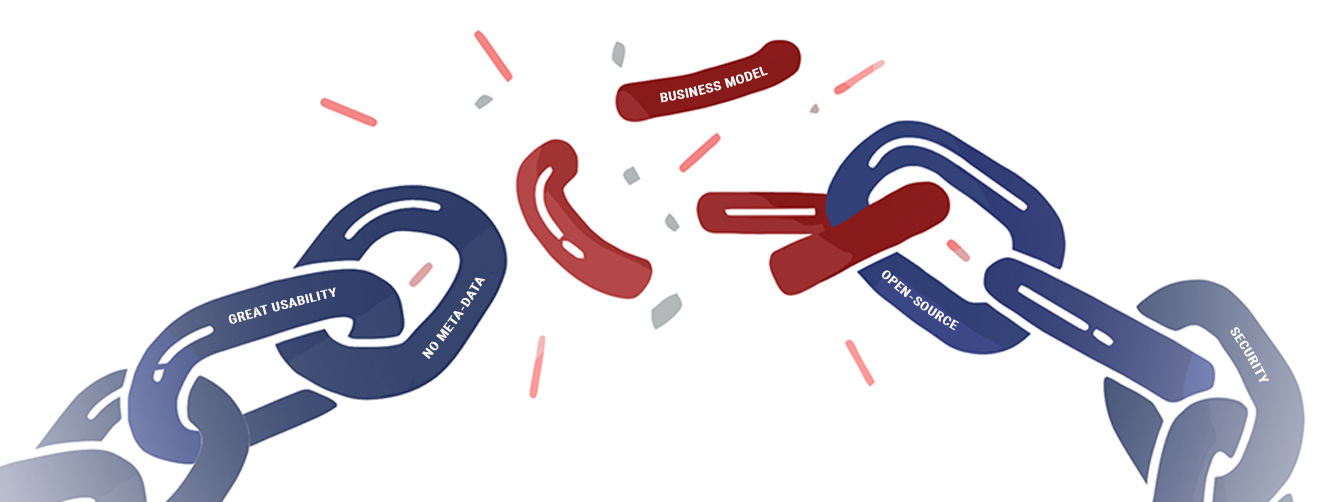
codeBut who pays for all of this? That is such a critical question to ask in order to understand where a company stands and where it is heading.
Internal https://safing.io Link
-
<div class="markdown-container"> <!-- Markdown Example --> <blockquote> <p>blockquote</p> </blockquote> <h1>h1</h1> <h2>h2</h2> <h3>h3</h3> <h4>h4</h4> <p><em>em</em></p> <p><strong>strong</strong></p> <p><code>code</code></p> <p>But who pays for all of this? That is such a critical question to ask in order to understand where a company stands and where it is heading.</p> <p><a href="https://world.hey.com/jonas/how-money-dictates-design-decisions-5e866cd9">External Link</a></p> <p><a href="/ownership/#influences">Internal / Link</a></p> <p><a href="https://safing.io/esa-bic/">Internal https://safing.io Link</a></p> <p><img src="https://safing.io/assets/img/blog/breaking_chain.png" alt="image displays a chain with many strong links (no meta-data, security, usability) but still breaking at its weak link (business-model))"></p> <!-- Markdown Example --> </div> -
.markdown-container {
    @apply element-x-center;
    @apply px-10;
    @apply max-w-4xl;
}

.markdown-container > h2,
.markdown-container > h3,
.markdown-container > h4,
.markdown-container > h5,
.markdown-container > h6,
.markdown-container > h1 {
    @apply mt-8;
    @apply mb-3;
}

.markdown-container > h1 {
    @apply text-4xl;
}

.markdown-container > h2 {
    @apply text-3xl;
    border-bottom: 1px solid #d7d7d7;
}

.markdown-container > h3 {
    @apply text-2xl;
}

.markdown-container > h4 {
    @apply text-xl;
}

.markdown-container > h5 {
    @apply text-lg;
}

.markdown-container > h6 {
    @apply text-md;
}

.markdown-container > hr {
    margin-bottom: 1.25rem;
    margin-top: 1.25rem;
}

.markdown-container > [class^=' alert'],
.markdown-container > [class*='alert'] {
    margin-bottom: 1.25rem;
    margin-top: 1.25rem;
}

.markdown-container > p:not(:first-of-type):not(:last-of-type) {
    margin-top: 1rem;
    margin-bottom: 1rem;
}

.markdown-container > p:not(:first-of-type) {
    margin-top: 1rem;
}

.markdown-container > p:not(:last-of-type) {
    margin-bottom: 1rem;
}

.markdown-container > p > code {
    color: #ba00bf;
    font-size: 0.875rem;
    font-weight: 500;
    word-break: break-word;
}

.markdown-container > p > code::after {
    content: '`';
}

.markdown-container > p > code::before {
    content: '`';
}

.markdown-container > a,
.markdown-container > ul > li > a,
.markdown-container > ol > li > a,
.markdown-container > p > a {
    @apply link-primary;
}

.markdown-container > a[href^="http"]:not([href*='safing.io']),
.markdown-container > ul > li > a[href^="http"]:not([href*='safing.io']),
.markdown-container > ol > li > a[href^="http"]:not([href*='safing.io']),
.markdown-container > p > a[href^="http"]:not([href*='safing.io']) {
    @apply link-primary-external;
}

.markdown-container > p > img {
    border-radius: 0.375rem;
    box-shadow: 0 0 5px 0 rgba(0, 0, 0, 0), 0 0 90px 0 rgba(59, 93, 199, 0.1);
    display: block;
    height: auto;
    margin-bottom: 4rem;
    margin-top: 5rem;
    max-width: 100%;
}

.markdown-container > ul {
    list-style-type: disc;
    padding-left: 1.85rem;
    padding-top: 1rem;
    @apply space-y-2;
}

.markdown-container > ol {
    list-style-type: decimal;
    padding-left: 1.85rem;
    padding-top: 1rem;
    @apply space-y-2;
}

.markdown-container > blockquote {
    border-left: 4px solid #ddd;
    @apply text-safing-gray-600;
    margin-top: 1.55rem;
    opacity: 1;
    padding-left: 1rem;
}